3 min
08/22/2025

When you think about branding, what comes to mind? Logos, color schemes, product packaging, and maybe your tagline? While all of these elements are essential, there’s one often-overlooked component of brand identity that can make or break your connection with customers: typography.
Typography goes beyond simply choosing a font. It’s a form of visual communication that speaks volumes about who your brand is and how your customers perceive it. The font you choose isn’t just about looking good — it’s about creating a feeling, a message, and a unique personality that resonates with your target audience.
In this article, we’ll explore why typography is a critical element of branding and how the right font choice can elevate your brand identity.
Font choice may seem like a small detail, but it can significantly influence the way people perceive your brand. Fonts convey emotion, tone, and even values. A font can make your brand feel professional, trustworthy, playful, or modern — and these feelings play a crucial role in how potential customers connect with your brand.
For example, a tech startup might use sleek, minimalist sans-serif fonts to communicate innovation and modernity, while a luxury brand may opt for elegant serif fonts to evoke sophistication and timelessness. A playful, handwritten font can give off a friendly, approachable vibe, while a bold, blocky typeface might convey strength and confidence.
Just as colors evoke emotions (think blue for trust, red for excitement), the fonts you choose help establish the tone of your brand. For example, using a clean, modern font for a technology company conveys innovation and forward-thinking. On the other hand, a more decorative or ornate font might suit a boutique store that focuses on unique, hand-crafted goods.
The key is to match the tone of your typography with the overall message you want to send. A mismatch here can confuse potential customers or even make them question your brand’s authenticity. Think about your target audience, your industry, and your brand’s personality — your font choice should align with these elements to create a cohesive experience.
While it’s important that your typography represents your brand’s personality, readability should always come first. A beautiful font that’s hard to read can negatively impact the user experience and leave a poor impression of your brand. Clarity is essential, especially when customers are quickly scanning your website, social media posts, or marketing materials.
When choosing a font, ask yourself:
Investing in legible, high-quality fonts will not only improve your brand’s readability but also enhance the overall customer experience, making it easier for people to engage with your content.
Consistency is key when it comes to brand identity. Your fonts should be used consistently across all touchpoints, from your website to your social media to your promotional materials. Consistency in typography helps to reinforce your brand’s message and makes your brand more recognizable.
It’s not just about using one font everywhere — it’s about developing a system of fonts (usually a combination of one or two primary fonts and a secondary one) that works well together and creates a harmonious visual identity. For instance, you might use one font for
headers and another for body text. This approach allows for flexibility while still maintaining a unified brand look.
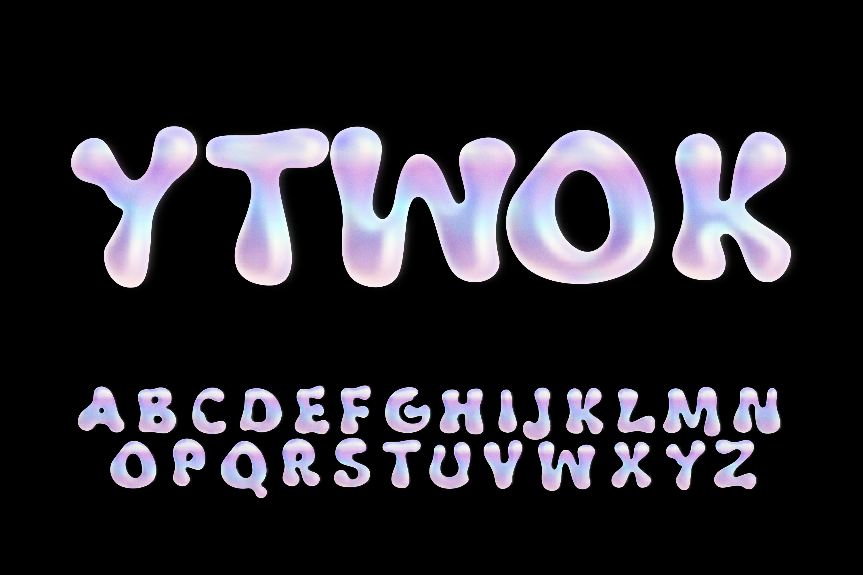
The typeface you choose carries emotional weight. Think about how certain fonts make you feel when you see them. A bold, angular font may convey excitement or strength, while a rounded font may seem friendly or approachable. Fonts influence your subconscious response to the brand, so it’s important to choose a typeface that resonates with your audience.
For example, a law firm or financial service provider might use traditional serif fonts to instill trust and professionalism. In contrast, a fitness brand might choose a bold, modern font to communicate energy and strength. The goal is to evoke the right emotional response to connect with your target market.
Now that we know how important typography is, how do you choose the best font for your brand? Here are some tips:
Typography is an essential part of your brand identity that should not be overlooked. The right font can convey your brand’s personality, evoke the right emotions, and make your messaging more impactful. On the other hand, the wrong font choice can confuse customers and make your brand feel disjointed.
As you develop your branding strategy, don’t underestimate the power of typography. Take the time to choose the right fonts that align with your brand’s voice, values, and target audience. When done right, typography can become one of the strongest tools in your branding arsenal.